In project 1a you will apply CSS styling and positioning to make your portfolio website fully responsive as specified below.
Time to complete: 1-3 hours. If it’s taking you longer than this, see me for help!
Visual layout:
1. Your portfolio site is very simple. It consists of a page heading and several sections (see Activity 3/4). The top section has your image on the right and a block of text with your name and email address (at a minimum). Below that, on a row to itself, there should be a block for Sample Coursework with a link to fontfun (Activity 5) and any other links you want to add. Below this row are the sections for each project. Each section contains some text about the project and a label. You can use dummy text for projects 2-3. How the project sections are laid out on the screen is going to depend on the width of the browser window (i.e., responsive design).
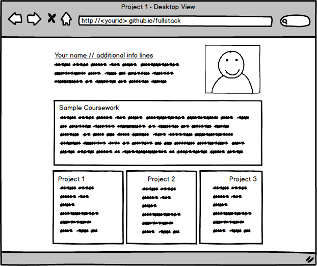
2. Layout: In the desktop view (992px and above), each of the 3 project sections should take up an equal amount of space on the screen. The labels for Project 1,2, and 3 should be left justified, centered, and right justified respectively. As you make the browser window wider or narrower, each section should become wider or narrower. For a visual reference of this view, see the desktop mockup illustration below.
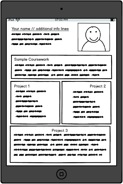
3. Layout: In the tablet view (between 768px and 991px, inclusively), the first 2 project sections should be in the first row and be of equal size. The label for Project 1 is left justified and the label for project 2 is right justified. The 3rd project should be on its own row and take up the entire row by itself with its label centered. For a visual reference of this view, see the tablet mockup illustration below.
4. Layout: In the mobile view (equal to or less than 767px), you guessed it, each section should take up the entire row with a left justified label. Your image should also shrink to ensure there is enough for your name and email address. For a visual reference of this view, see the mobile mockup illustration below.
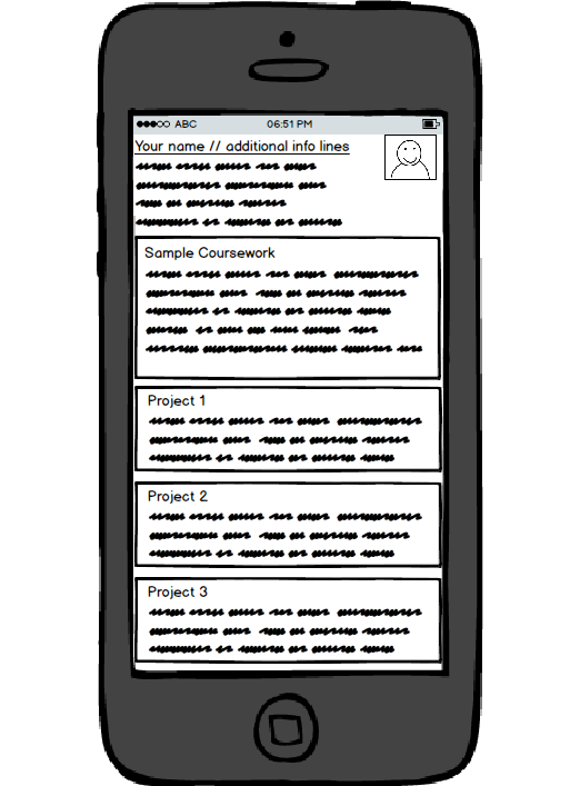
5. Spacing: Pay attention to the spacing shown in the mockup illustrations. Note the spacing between sections should be consistent. Note that the horizontal spacing between the edges of the section and the edges of the browser window decreases as the screen width gets smaller. Also, note the spacing between the dummy text in each section and the edges of the section. Lastly, make sure the dummy text is “pushed down” enough so it doesn’t overlap the section title region.
6. Borders and Colors: Each section should have a background color set to some color (of your choosing). Set the background color of each section title region to some unique color (of your choosing). Make sure that the background color still allows the user to view the text in the section and section title regions. Depending on the color you choose, you may want to change the color of the text so it can be easy to read. Set a black border on both the section and section title region that is 1px thick.
Rules and constraints
1. Your page must include a single CSS file. No inline styles allowed. Your CSS file should be placed into a folder named css under your root folder for this class.
2. You are NOT allowed to use any existing CSS (or Javascript) framework for this assignment (for example, Twitter Bootstrap CSS Framework is not allowed!). No framework CSS files should even be referenced in your index.html, even if you are not using them. You are going to create your own framework from scratch.
3. You must implement the following breakpoints that will be considered desktop, tablet, and mobile. The browser should display a desktop version of the site when the width of the browser window is 992px and above. Tablet view should appear only if the width of the browser window is between 768px and 991px, inclusively. The mobile view should appear only if the width of the browser is equal to or less than 767px.
Turn in
I will create an assignment in google classroom. Submit just the link to your github.io page before the due date (2/7/2018 @ 9:00 AM). Late assignments will be accepted with a half-letter grade per day penalty.
Extra Credit
If you have your project done and turned in by class time on 2/5/2018 and show me your portfolio site in class on that day you will receive an extra half-letter grade (you can’t get a score higher than an A=100%, however).
Rubric
100 points total.
10 points, site has the minimum required information (name, contact information, image, sample coursework, project 1, 2, 3).
25 points, layout >= 992px shows three columns, formatted as specified above.
25 points, layout between 768px and 991 px shows two columns with correct formatting, formatted as specified above.
25 points, layout <= 767px shows one column, formatted as specified above.
10 points, HTML and CSS follows generally good coding practices, is formatted nicely, uses semantic tags, and is easy to understand.
5 points, proper submission.
Acknowledgements
This assignment is roughly based on https://github.com/jhu-ep-coursera/fullstack-course4/tree/master/assignments/assignment2 by Mr. Yaakov Chaikin.